My diagnosis and method
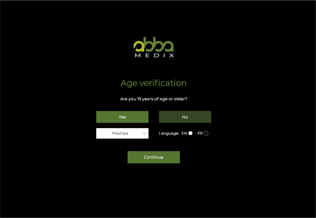
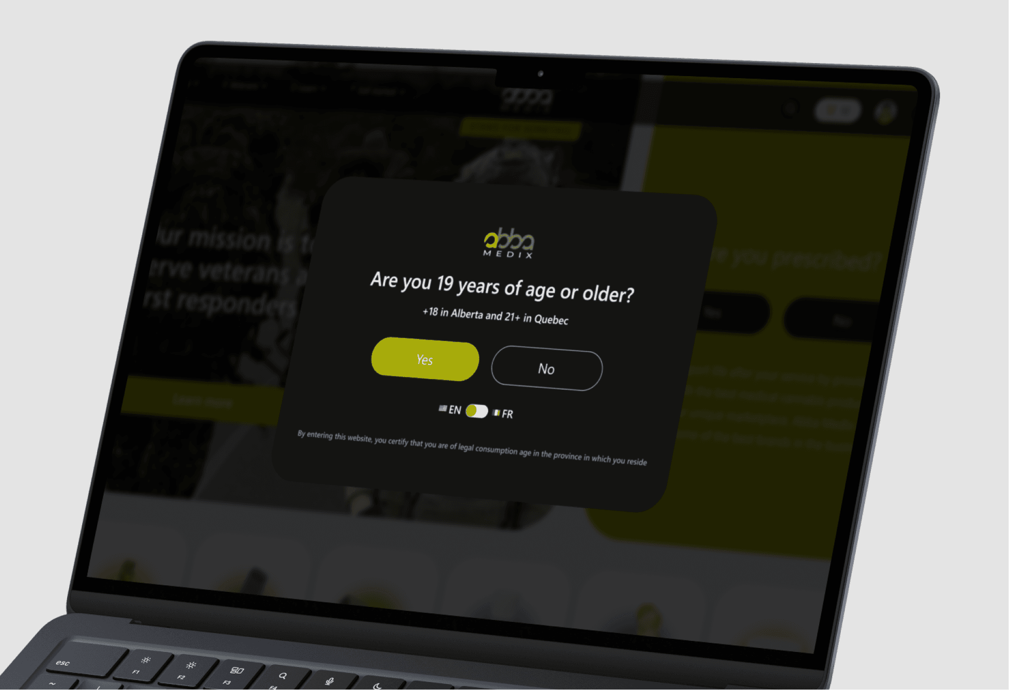
My first step was to dive into the data to understand the scope of the problem. The analysis was a combination of quantitative and qualitative data: 1. Quantitative analysis: Google analytics data told a brutal story: a 45% bounce rate right at the front door (the age verification screen) and a painful 0.8% conversion rate. It was clear we were losing almost half of our users before they even saw a single product. 2. Qualitative and heuristic analysis: But numbers only tell half the story. A heuristic analysis revealed clear violations of Nielsen's principles. This wasn't just my design opinion; users in our research said the site "looked untrustworthy." The confusing navigation and inefficient filters created a high-friction journey.
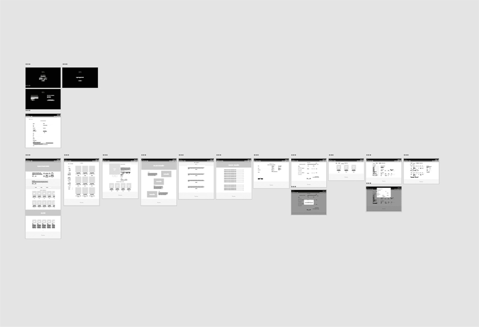
Redesign Strategy and Execution
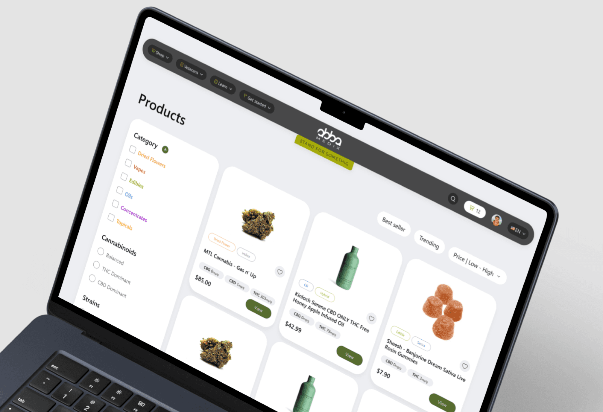
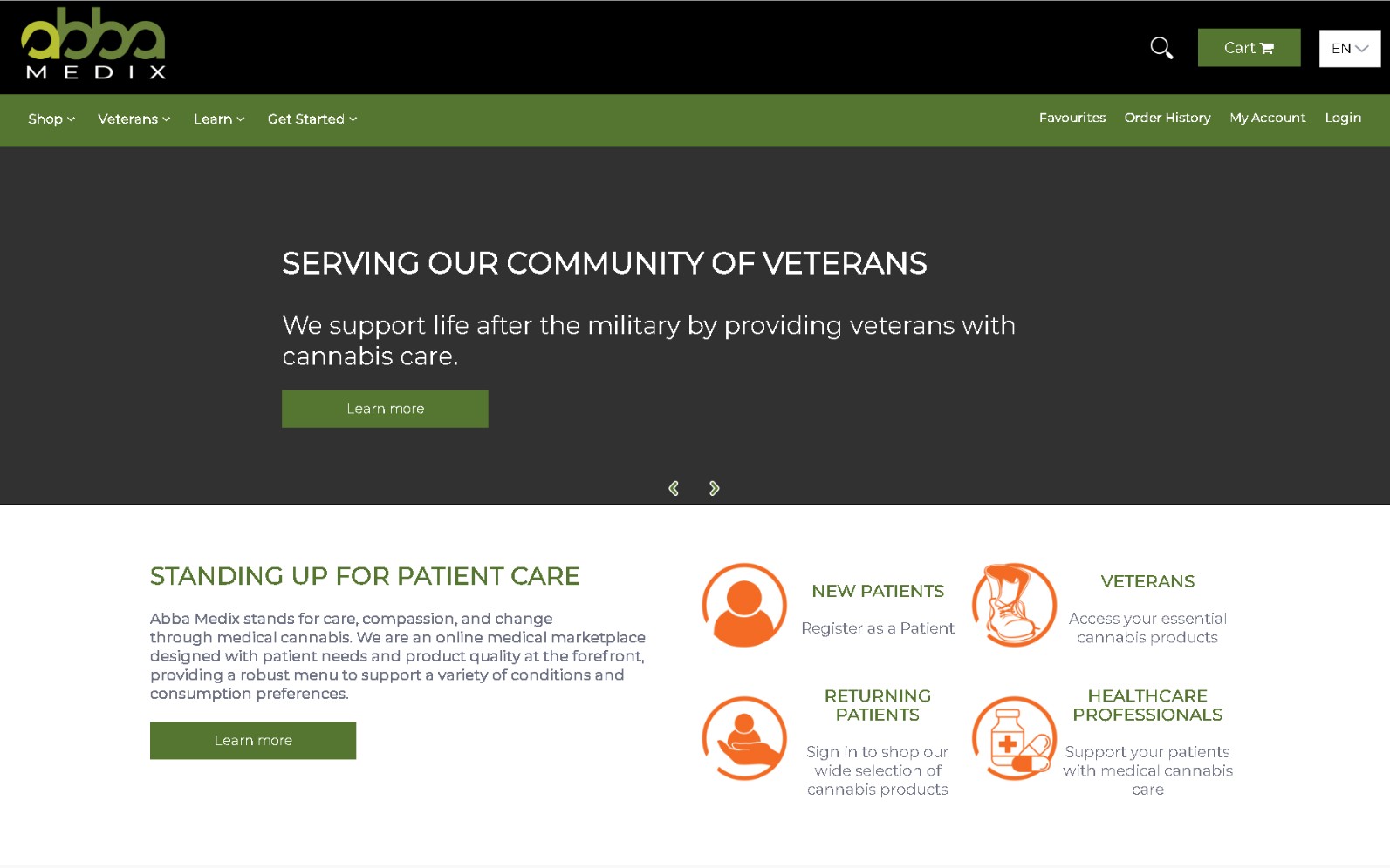
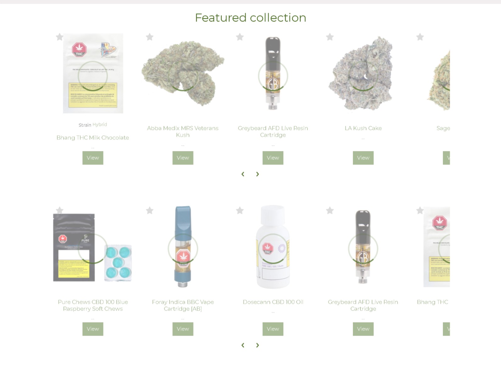
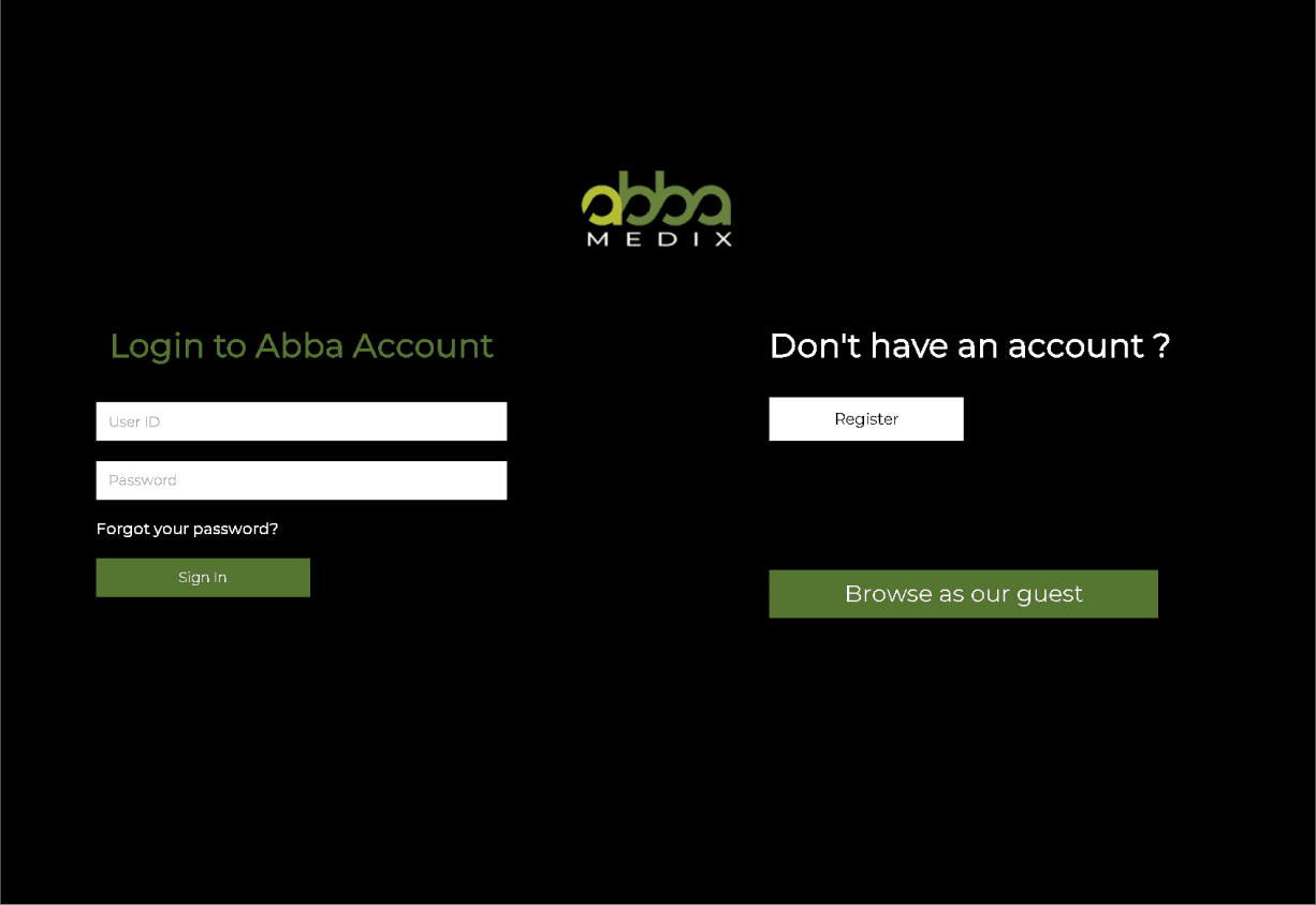
My strategy was twofold: first, plug the biggest leaks immediately, and second, overhaul the entire experience to build trust and simplify the shopping journey. The age-gate with its 45% bounce rate was the most obvious leak. I replaced with a one-click modal. It was the easiest and most impactful win. To tackle the trust issue, I redesigned the entire visual language, focusing on a clean, professional visuals. For navigation, I scrapped the old menu and implemented a clear mega menu, redesigning the information architecture to reduce cognitive load. Finally, to make product discovery easier, we created a robust and intuitive filtering system.
The Solution: Optimization at Every Step of the Journey
The impact of the changes was immediate and significant. In the first three months, we saw: • A 45% drop in the overall bounce rate, especially at the site's entry point, proving the new access flow was successful. • A 75% increase in the conversion rate, which rose from 0.8% to 1.4%. • A 25% growth in average session duration, indicating that users were more engaged and exploring the catalog more deeply.


Learnings
For me, Abba Medix was a powerful reminder that visuals aren't just decoration they are a function of trust. The biggest lesson was seeing the direct, undeniable line from fixing a single heuristic violation to a massive improvement in a core business metric.